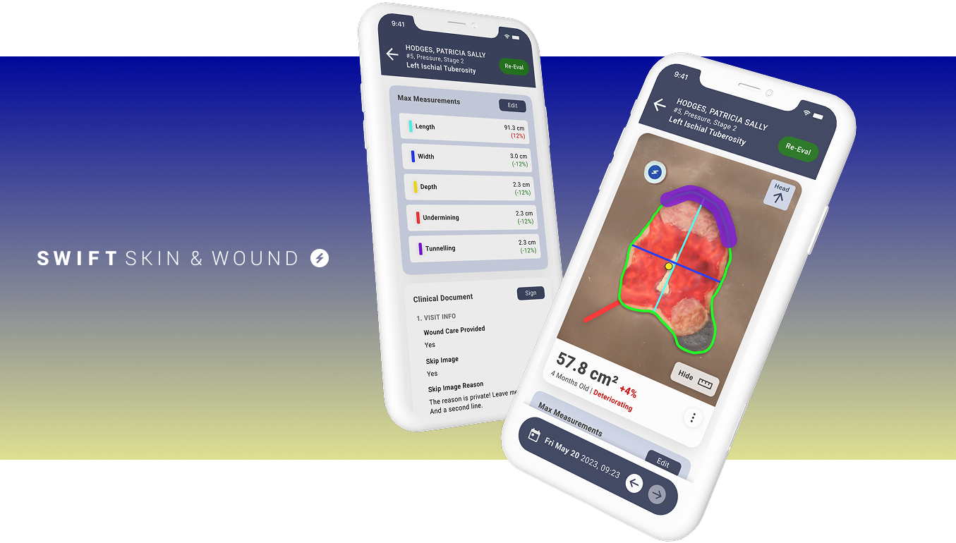
Most complex design problems do not feel complex because there is too much information. They feel complex because the information is not organized around the decision someone needs to make next.
That distinction matters. A product screen, campaign page, or onboarding flow can carry a lot of detail and still feel calm when the hierarchy is doing its job. The work is not always to remove content. Often, the work is to make the next useful action impossible to miss.

Clarity usually starts before the interface
The strongest design systems and digital experiences tend to begin with a strategic simplification: who is this for, what are they trying to accomplish, and what would make the next step feel obvious? Once those answers are clear, layout, typography, and visual rhythm have something useful to support.
This is why design work can look deceptively quiet at the end. The final screen may feel simple, but that simplicity is usually the result of removing competing priorities, naming the real problem, and creating a structure that can hold up under pressure.
The goal is confidence
Good design does not just make something look finished. It helps customers, teams, and stakeholders move with more confidence. That might mean a clearer donation path, a more useful product workflow, or a brand system that finally gives every touchpoint the same voice.
When complexity is handled well, people do not notice the work. They simply understand what matters, trust what they are seeing, and know what to do next.